Stress-Test Your SwiftUI Accessibility in a Single Preview
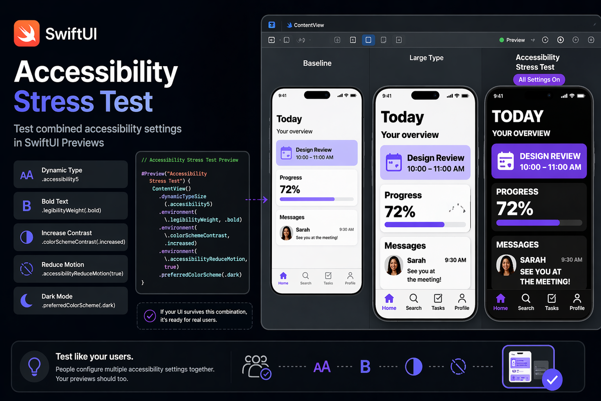
Most iOS developers test accessibility one setting at a time: flip Bold Text on, check the layout, flip it off, bump Dynamic Type up, check again. The problem is that your users don't toggle one setting in isolation — they set up their device once and forget about it. That person with low vision likely has maximum Dynamic Type, Bold Text, and Increase Contrast all enabled simultaneously. Individually, your layouts might survive each of those. Combined, they can break in ways you'd never predict from single-axis testing.
SwiftUI previews let you collapse that entire matrix into a single canvas view, without touching Simulator settings or needing a device in front of you. Here's how to build a proper accessibility stress-test preview and what to watch out for along the way.
Stacking Environment Keys for Combined Testing
SwiftUI exposes public environment keys for the accessibility settings that matter most to layout. You can inject all of them at once in a #Preview:
#if DEBUG
#Preview("Accessibility Stress Test") {
    ContentView()
        .dynamicTypeSize(.accessibility5)
        .environment(\.legibilityWeight, .bold)
        .environment(\._colorSchemeContrast, .increased)
        .environment(\._accessibilityReduceMotion, true)
        .preferredColorScheme(.dark)
}
#endif
.dynamicTypeSize(.accessibility5)— the largest Dynamic Type size, roughly 3× the default body font size\.legibilityWeight, .bold— mirrors the "Bold Text" accessibility setting\._colorSchemeContrast, .increased— mirrors "Increase Contrast" in Accessibility settings\._accessibilityReduceMotion, true— mirrors "Reduce Motion".preferredColorScheme(.dark)— dark mode is worth including because contrast ratios behave differently there
The key insight: if your UI survives this combination, it handles the vast majority of real-world accessibility configurations your users will have.
A Note on Underscore-Prefixed Keys
\._accessibilityReduceMotion and \._colorSchemeContrast are private SwiftUI environment keys, and they are required for this technique — there is no alternative. The public counterparts (\.accessibilityReduceMotion, \.colorSchemeContrast) are read-only: they expose the current system value but have no setter, so passing them to .environment() won't compile.
Because private symbols are not permitted in App Store binaries, wrap every #Preview that uses these keys in #if DEBUG / #endif. That keeps them out of release builds and avoids App Store rejection.
For contrast: \.legibilityWeight, \.dynamicTypeSize, and \.preferredColorScheme are public and writable — no underscore needed and no #if DEBUG guard required for those.
The Gotcha: Custom Fonts Don't Respect Bold Text
System fonts (SF Pro) automatically respond to legibilityWeight. If you're using a custom typeface, they don't. This is the most common layout regression developers miss in combined stress tests.
When legibilityWeight is .bold, you need to manually map it to your bold font variant:
struct AdaptiveLabel: View {
    let text: String
    @Environment(\.legibilityWeight) private var legibilityWeight

    var body: some View {
        Text(text)
            .font(.custom(
                legibilityWeight == .bold ? "MyFont-Bold" : "MyFont-Regular",
                size: 17,
                relativeTo: .body
            ))
    }
}
If you skip this and inject .environment(\.legibilityWeight, .bold) in your preview, your custom-font views silently render in their regular weight. The layout might look fine — it's just not what users with Bold Text enabled actually see.
Structuring Multiple Preview Configurations
You'll want more than one stress-test preview: one for the worst-case combination, one for just large type, one for the baseline. The trap is creating too many inline previews in the same file — Canvas loads all of them and slows down.
A clean pattern is to group related configurations in a dedicated preview file:
// ContentView+Previews.swift
#Preview("Baseline") {
    ContentView()
}

#Preview("Large Type") {
    ContentView()
        .dynamicTypeSize(.accessibility5)
}

#if DEBUG
#Preview("Accessibility Stress Test") {
    ContentView()
        .dynamicTypeSize(.accessibility5)
        .environment(\.legibilityWeight, .bold)
        .environment(\._colorSchemeContrast, .increased)
        .preferredColorScheme(.dark)
}
#endif
Keeping previews in a separate file means you can close that tab when you're not running accessibility checks, and Xcode won't compile them during normal editing.
Edge Cases Worth Watching
Numeric labels and sliders — these almost never get tested at .accessibility5. A progress bar label that reads "72%" in regular type often truncates or overlaps at maximum size. Check every view that renders numbers or short strings with bounded width.
Icon-only buttons — accessibilityReduceMotion doesn't affect static icons, but if you're using animated SF Symbols (.symbolEffect) or Lottie animations, this flag should be your signal to swap in a static fallback. The stress-test preview won't animate, so it's easy to forget.
VoiceOver is still a separate step — previews test visual layout. They don't tell you whether your accessibilityLabel values make sense when read aloud, or whether your element grouping is logical. Once layout passes the stress test, run through the critical paths on device with VoiceOver. The visual and auditory accessibility surfaces are different problems.
Summary
Stacking SwiftUI environment keys in a #Preview gives you a fast, reproducible way to catch the layout bugs that only appear when multiple accessibility settings collide — which is exactly how real users configure their devices. Use \._accessibilityReduceMotion and \._colorSchemeContrast inside #if DEBUG (private keys required — the public versions are read-only and have no setter), and use the public \.legibilityWeight, \.dynamicTypeSize, and \.preferredColorScheme freely. Remember to manually handle Bold Text for custom fonts, and treat the stress-test preview as a complement to, not a replacement for, real-device VoiceOver testing.